Archive by Author

Brittany Fowler: Final Post

4 Dec

Let me start off by saying that I am taking away a lot from this class. Throughout the semester I learned more about Adobe applications like InDesign, Photoshop and Illustrator and how to use them to their full extent. I learned how every design follows some type of grid (and if it doesn’t, it’s a poor design). In addition I learned how typefaces help set the tone for a design and influence the viewer’s attitudes (and I learned that they are called typefaces, not fonts). Learning how to effectively design and learning about the Adobe applications will help me in the future if and when I need to design something.

Another thing this class taught me was time management and how to accept constructive criticism in order to better a project. This will help me in my daily life because no matter what path I choose, I will always need to have time management. Also, working environments always have differing opinions, making the ability to accept constructive criticism and suggestions a vital skill to have. This class also pushed me out of my comfort zone on a few occasions, forcing me to figure things out and reach out for help.

Brittany Fowler: Post No. 9

14 Nov


Friends of the Children is an intervention program that helps at-risk children in New York City stay on the right path towards a successful future. Beginning in kindergarten, full-time youth volunteers, called friends, are paired with children and stay with them through high school graduation. While designing the website, I kept the target audience in mind, which are either the “friends” looking to help or individuals wanting to enroll a child. My main goals were to make the website easy to navigate and to avoid text-heavy pages. On the primary pages I have bullet points highlighting the important information so it’s quick and easy to read. I also included a secondary navigation so it’s easy to click from one page to the next. Also, whatever page they are on is a different color than the other links so they’ll always know where they are. For my color palette I chose to go with the same blue as their logo with a lighter blue for the navigation bar. All of the links are crimson so they stand out without being too obnoxious. I also have a donate button and a current news sidebar on every page for the user’s convenience.

Brittany Fowler: Post No. 8

6 Nov

In the documentary they mentioned how Helvetica is a versatile typeface because it conveys several different meanings depending on the context. In other words, the typeface can be interpreted in different ways. A typeface’s stroke width, counter size, and overall construction help convey a message. Heavy stroke widths are strong whereas lighter ones are more feminine. A typeface with large counters may be considered more fun and playful compared to a typeface with smaller ones. Novelty typefaces are extremely good at creating a mood, feeling and image. For example, the typeface curly is quirky, fun, and upbeat. I personally always have a reaction to Vogue’s typeface. The varying stroke width’s balances femininity with bold confidence. By putting the word all in caps, it shows the magazine’s dominance before anyone can even flip through the pages. This typeface conveys the magazine’s content and evokes a feeling in readers before they devour the pages.

This documentary showed me just how important a typeface is in graphic design. A typeface’s readability is just as crucial as the message it must help convey. I never realized how often Helvetica is used and how versatile it is. Depending on the surrounding content, Helvetica can help evoke certain emotions in viewers, and it is very easy to read. I also never realized how we are constantly exposed to typefaces all day. Whether it is on a poster, a food label, a textbook, or even a person’s handwriting, we are always viewing different typefaces. The documentary also made me think about how every typeface has been designed by a person. This might sound like a no-brainer, but I never thought about how each typeface is actually manually constructed and designed by someone. Overall, the documentary made me realize what a vital role typefaces are in our lives.

Brittany Fowler: Post No. 7

31 Oct

Anne Taylor LOFT

The key to a great website is usability. If the user has to work in order to navigate the site, then the design is poor. Anne Taylor LOFT is an example of a great website because it is very easy to navigate and it appeals to the target audience. People visiting this website want to shop online. Therefore, the layout must be clean, incorporate photos, and allow users to navigate through different categories. The homepage doesn’t have a lot of text and has a large visual to attract the viewer.  LOFT’s primary navigation bar stays within the seven plus or minus two rule and is very self explanatory. Also, once you leave the homepage you can easily return by clicking on their wordmark. Since the site is for online shopping, the layout of each primary page needs to be extremely easy to click through. LOFT caters to their audience by allowing users to narrow their search and change how many products are on each page at one time. For my interface design, I also want to cater to my audience and have clean layouts that are easy to navigate.

Brittany Fowler: Post No. 6

23 Oct

My poster provides information about an event hosted by Livestrong called Challenge Austin. The event takes place over the course of two days and involves a 5k run/walk along with varying distance bike rides. Since the event is in Austin, Texas, my target audience is people living in and around the area. For my design, I decided to appeal to my target audience by incorporating Texas into my design. I based my main heading off of Austin’s slogan “keep Austin weird” in order to grab their attention. This sense of weirdness is also portrayed through the stroke I chose for the outline of Texas. Since Livestrong’s colors are yellow and black, I decided to make the background a mellow yellow. I made the star, representing the capital, a bit brighter to draw attention. My design follows the ‘z’ direction eyes make. The main heading grabs attention, which is then directed to the yellow star, down to the action verbs, and finally to the bottom right corner where the person can learn how to get more information. I chose Folio as my typography because I feel like it is strong, which helps convey the event’s attitude.


Brittany Fowler: Post No. 5

18 Oct

This is an advertisement from the 2010 holiday season for Tiffany and Co. The photograph works extremely well in portraying Tiffany’s brand and conveying a particular mood. Tiffany and Co. is about romance, falling in love, and timelessness. Through the male model’s gaze and the interlaced fingers, these qualities are exemplified. The female model’s gold dress blowing in the wind adds a whimsical feel to the photo, almost as if it were a dream. However, what makes this photograph work is the iconic Tiffany and Co. blue box. For this reason, the photo would not work in black and white. The colors help define the dreamlike atmosphere while the iconic Tiffany’s box stands out. Colors may have been enhanced and altered, but other than that I don’t believe there is any drastic manipulations to the photograph. It captures a moment in time while telling a story. Tiffany and Co. successfully advertised not only a product, but also a feeling and image.

Brittany Fowler: Post No. 4

9 Oct

My logo sets the tone for my stationary set design. I want to be a fashion journalist so I created a high-heeled shoe with a pencil for the heel. The shoe represents confidence, style and a sense of professionalism, which is what I wanted to convey. I decided to incorporate color into my design because it is a good branding technique. Purple has always been my favorite color and I feel this feminine and vibrant shade expresses who I am as a person. The designs for my stationary set are clean and simple, making them easy to read. The content in my designs match the color of the heel so it ties into my logo. In order to keep consistency, I ensured the shoe faced the same way for each design and I always placed it on the left hand side. I chose Bodoni Book for my typeface because of the different stroke weights. It resembles Vogue’s typeface, which complements my logo because my logo represents fashion journalism. My logo and stationary set have both personal and professional qualities. The simplistic layouts have an organized and professional feel while my logo expresses my personality.

Brittany Fowler: Post No. 3

2 Oct


Perfume advertisements are always interesting because the ad has to sell a scent. I believe this Dior perfume ad is great because I get a sense of what the actual perfume would smell like. Since the ad was shot in a garden full of flowers and roses, I imagine the perfume to have a fresh floral scent. The soft lighting and faded color gives the ad a whimsical, dream-like feeling. Also, the ribbon that spells out Miss Dior and the touches of pink adds a strong feminine touch. This ad transports me to a garden and captivates almost all of my sense. In my ad I want to create a feeling and be able to take the viewer away like this Dior ad does. I want to attract the viewer and evoke a response by appealing to the viewer’s five senses.


Brittany Fowler: Post No. 2

25 Sep

Example of a good logo:

I believe the Chanel logo is an example of a good logo because of its simplicity. The logo reflects all aspects of the brand. Chanel produces clothes and accessories that are timeless, chic, and polished. The company’s elegance and sophistication is reflected through the sleek and simple logo. A very simple, sans-serif typeface is used for the iconic Cs and the Chanel oftentimes printed underneath as opposed to a novelty or script typeface. This reflects the brand’s simple and timeless designs. On a more literal note, the two Cs represent the designer Coco Chanel, who helped change women’s fashion and designed the little black dress. The logo has become well known throughout the world and is easily recognizable. It doesn’t need any frills to stand out or be known, just like the clothes and accessories it represents.


Example of a mediocre logo:

Although this logo has become well known to many people, I do not believe it is a strong because of the typeface. I understand that by having the logo in a script typeface it adds a personal element, but I think it is too difficult to read. Also, there is not a lot of tracking between letters, making it harder to read. When I was younger I knew of Lord and Taylor and had been in the store, but didn’t realize that their logo actually said Lord and Taylor. If I were from a different country and was not familiar with the popular department store, I would have a difficult time figuring out what it was. Lord and Taylor could have made it more legible and easier to decipher.


Bonus:

This business card utilizes graphics, color, and continuation to successfully communicate the card’s information and instantly lets the viewer know the card deals with sewing. The thread leads the viewer’s eye to the actual school name while the tape measurer guides the eye to the contact information.


Brittany Fowler: Post No. 1

20 Sep

Hey everyone,

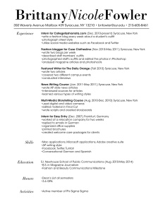
As I was planning how to design my resume I constantly reminded myself that I wanted it to be clear, easy to read, and reflect my personality. Since I aspire to be a fashion journalist, my target audience is the editorial side of the fashion industry. I feel like the typeface for my wordmark resembles Vogue with the varying stroke widths. Since my personality is upbeat and feminine, I italicized my middle name to not only add contrast but also to soften my wordmark. The layout of my resume is simple and clean so the reader remembers the content rather than the design. I feel like the typeface used in the body is easy to read and I linked it to the wordmark by italicizing my headings. Overall, my goal was to create a resume that appears professional with subtle feminine touches.