Hey everyone,
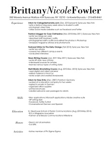
As I was planning how to design my resume I constantly reminded myself that I wanted it to be clear, easy to read, and reflect my personality. Since I aspire to be a fashion journalist, my target audience is the editorial side of the fashion industry. I feel like the typeface for my wordmark resembles Vogue with the varying stroke widths. Since my personality is upbeat and feminine, I italicized my middle name to not only add contrast but also to soften my wordmark. The layout of my resume is simple and clean so the reader remembers the content rather than the design. I feel like the typeface used in the body is easy to read and I linked it to the wordmark by italicizing my headings. Overall, my goal was to create a resume that appears professional with subtle feminine touches.

I think your resume is very effective. It is straightforward, organized, and easy to read. I like that you are consistent in using italics in your headings and bold in the beginning of your experience to match your word mark. Also the edges of your name appear to outline the body of your resume. A very subtle touch, but makes the whole piece look that much better. I believe it appeals to your target audience well because it clearly states your information, but is put together in an elegant, but simple, manner–two traits I would associate with a fashion journalist. Your resume is simple enough to not draw attention away from content, but different enough to be memorable to potential employers. You achieved a nice balance of conveying both your personality and professionalism.