Archive by Author

Caroline Castro: Post No. 9

14 Nov


This is my website design. The organization I chose is a non-profit that  promotes training people in wilderness and survival skills and sustainable living techniques. The target audience is anyone looking to expand their knowledge on living closer to the Earth and treating nature with more care and respect. Their website was not the worst of websites, but I felt it had too much repeated information that could easily be condensed. As well, they had plenty of great photos throughout the website, however none were placed in a way that created a response from the viewer–most were either too small or in obscure places throughout the site. All the photos I used were their own except for the mountain range at the bottom.  I chose a blue sky background to keep the nature theme strong and used earth tones as my main color scheme. I chose the font used in the word mark because I felt it made their name more distinctive. It also looks like tree branches bent into letters a little bit. Anyway, this is what I came up with, hope you like!

Peace,

C

Caroline Castro: Post No. 8

7 Nov

I chose this example of typeface because I think of all Radiohead’s covers, this stands out, solely because of the use of type. If you line them up next to each other, this one clearly illustrates their style and message. It goes along the same lines as Helvetica because it has simple, clean lines that are easy to read. In my opinion, the text is more prominent than the image, simply by its arrangement and color choice.

I think the film Helvetica was pretty good, even though I honestly think it was a little drawn out by the end of it. People really have plenty to say about this font which made me realize how important it is. Helvetica is everywhere in our lives at this point, all because it has an unparalleled clarity that translates to languages all around the world. The film made me appreciate the hard work of typeface developers, and truly understand how challenging it is to make a typeface that universally accepted. The creator of Helvetica was very intuitive to the needs of people in modern society.

Caroline Castro: Post No. 7

30 Oct

Evol Foods

I chose this website because it coincides with the type of website we are creating for the project; one where the viewer is mostly someone who sought out the website looking for specific information, rather than just browsing. The site clearly communicates the company’s youthful, quirky vibe, while still presenting all the information in an easy to read manner. It is a successful website because the home page features a large, changing graphic showing some of their products, and then only a few highlights and recent events below that. The viewer barely has to to scroll to reach the bottom of the page. The home page also has very accessible links to social media.  The remaining information is arranged into only FOUR tabs that each have three to five sub tabs within them, making the information concise and organized. I was able to find out all the information I would want to know quickly and easily, and never had to scroll down more than a few inches. Their content is also very funny, and whimsical which I think makes it stand out from most websites.

P.S. I recommend their frozen breakfast burritos to everyone, available at Wegmans.


Caroline Castro: Post No. 6

24 Oct

So this is my poster. The organization is called “LoveHopeStrength” and their goal is to create cancer awareness through a series of benefit concerts in conjunction with bone marrow drives. My target audience for this poster is young people, probably in the age group of 19-30. This is an important age group to target because if people become involved with benefits like these from a younger age they will be more likely to develop a relationship with the organization as well as the cause. I think my poster creates a vibrant, youthful look that will effectively bring young people to this benefit concert. I used a western typeface to match the location as well as the jam band Furthur who is performing at the concert. I wanted to use  bright colors to keep it fresh and lively. I took the picture of the rocks and the burnt orange color used in the top headline is sampled from the rocks in the picture.

Caroline Castro: Post No. 5

17 Oct

I chose this ad because the idea behind this series of Dove ads goes along with what we were discussing in class on thursday. Dove wanted to create a series of advertisements that featured “real” women that had not been retouched. They first started this with their normal body lotions for young to middle aged women of all sizes and skin types, and then followed up with this series of anti-aging advertisements. There was plenty of controversy about these ads because other retouchers in the ad industry tried to claim that the photos had been retouched, even though Dove claimed that they were not. It is hard to say who is right, but either way I think it sends a very bold message. In America it seems that all women and even men view aging as a horrible process that needs to be reversed in any way possible, while in other countries looking older is a sign of wisdom and respect. I like these ads, although some people might think that they are too bold or to forward. As far as black and white, I think it’s important to keep the color in this case because it focuses on the vibrance still noticeably present in the woman’s skin.

10 Oct


Hey everyone! So this is my final logo design. Basically I wanted a more personal logo that could be updated in the future to be more professional if need be. I think it has a very organic, natural quality about it–which compliments my personality and lifestyle. I don’t know if its very obvious but the two brown arcs are my initials, that also serve as a sort of trunk for the abstract tree I created. I chose these colors (brown, dark green, and bright green) not only because those colors together are my favorite combination but because they help it look more like a tree, and they’re also just calming and earthy which I enjoy. I chose this font (Highlander ITC) because the curves of the “C’s” in it kind of resemble the arcs I created that represent my initials, and the font in general goes along with the humanist look of the whole set. I think my tree represents growth and vitality, qualities that I hope to posses throughout the future both on a personal and professional level.

4 Oct

I chose this ad because I think it effectively promotes one of Ray-Ban’s core ideals: that there is a pair of Ray-Bans for every person out there, regardless of their personality. The images focus on intense color and give the viewer a sense of the fun, carefree lifestyle Ray-Ban fosters with their eyewear. This ad makes people want to be a part of this “club,” simply because the people they are featuring seem more vibrant than real life. Ray-Ban did a great job making each person distinctive yet cohesive with the style of the ad set. I also think the phrase “never hide” is perfect because sunglasses shouldn’t hide your personality, they should bring it to life.


Caroline Castro: Post No. 2

26 Sep

I think this is an example of a great logo because it is simple and distinctive (the top larger type is the actual logo, the bottom is the actual brand: RVCA). This brand is targeted it apparel and gear for surfers, skateboarders, and other extreme sports. I think that most of the other competitors in the market try and incorporate waves and excessive images in their logos which can be overkill. The usage of just the V and the A, along with the fact that the A is somewhat abstract, give the logo something very clean in comparison to the other logos in the market, making it distinctive.

I think this is an example of a terrible logo. As an avid pasta buyer, I have actually not bought this brand of pasta subconsciously because this logo is so boring.  Nothing about the font or shape has any connection to pasta or appeals to the type of people that buy pasta. There is nothing distinctive–all it says to me is standard. It removes the sort of romanticism associated with pasta.  In my opinion, a company should make their product appear to be of the highest quality, not the boring alternative. A simple change of font could completely change the opinion of pasta buyers.

Caroline Castro: Post No. 1

19 Sep

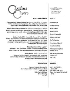
Hello all! This is my resume. The first aspect of my design strategy that I concerned myself with was the wordmark. I knew I wanted to do something creative with the repeating C’s of my initials. This turned out to be a little difficult because the letter “C” tends to make this awkward white space, especially when you increase the font size. I had trouble placing the remaining letters of my name in a way that was readable and fluid, but I think I finally got it right. I used the script to offset the very plain, clean-cut font (Avant Garde) in the remainder of the text. The meat of my resume was not organized this way until the day before we turned it in; it was originally in two columns flush left, but I decided it was simply too boring. In this way I hoped to convey my voice; I like to create structure in a creative way. I hope this is readable because I like the way it is balanced on the page. My target audience would basically be any potential employer, considering I am still not sure where the career winds will take me. Au revoir!