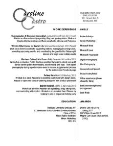
 Hello all! This is my resume. The first aspect of my design strategy that I concerned myself with was the wordmark. I knew I wanted to do something creative with the repeating C’s of my initials. This turned out to be a little difficult because the letter “C” tends to make this awkward white space, especially when you increase the font size. I had trouble placing the remaining letters of my name in a way that was readable and fluid, but I think I finally got it right. I used the script to offset the very plain, clean-cut font (Avant Garde) in the remainder of the text. The meat of my resume was not organized this way until the day before we turned it in; it was originally in two columns flush left, but I decided it was simply too boring. In this way I hoped to convey my voice; I like to create structure in a creative way. I hope this is readable because I like the way it is balanced on the page. My target audience would basically be any potential employer, considering I am still not sure where the career winds will take me. Au revoir!
- Comment
- Reblog
-
Subscribe
Subscribed
Already have a WordPress.com account? Log in now.
Caroline,
I absolutely love what you did with your resume. I understand your concerns about the white space in your wordmark, but the combination of the different fonts and sizes really makes it work. I really like the handwritten feel that your wordmark font creates. I feel like it shows a more personal touch. The way in which you created your grid is also very visually appealing. Aligning everything to the line makes a nice, clean cut grid. But, on the same note, be careful of flushing right. It can be hard to find your next line while skimming quickly. You did a good job trying to avoid confusion by making the lines of text relatively the same size. Great work!
-KC