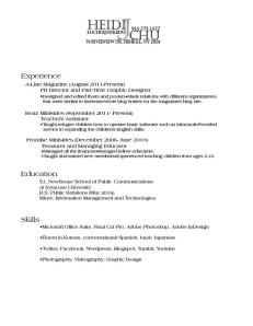
 My target audience is within the wide spectrum of corporations, small companies, and even law offices because my interests and goals of the future revolve around the career paths of a lawyer and a public relations practitioner. This is why I wanted to have a professional, dependable voice more than any other; my design strategy was essentially achieving the most neat, business-like resume possible. Rather than a cheerful, or a quirky voice, I aimed for a professional one because that is what I would look for as an employer and professionalism is what, I feel, is most valuable in a resume. So, after multiple versions of my name in ornamental, script, and bubbly typefaces, I eventually ended up with this one. It’s not necessarily artistic, or exceptionally appealing, but I chose it because it was the most formal of all my drafts. Through the typefaces of both my wordmark and my body text, I felt that I achieved a professional voice while also presenting myself as someone with potential and organizational skills.
- Comment
- Reblog
-
Subscribe
Subscribed
Already have a WordPress.com account? Log in now.
Heidi,
Your resume is very clean and organized but I feel like some things are missing. You haven’t really bolded or separated any titles, which makes my eyes work harder to see what positions you’ve held. If you used a sans serif font for the body text and then a different font for the header, it would be easier for employer’s to read. Also, your wordmark seems a little cramped with all your contact information around it. Making it bigger would really catch an someone’s attention. Don’t be afraid to take up the whole page when filling your resume!
Maddy Berner
I really like your wordmark and how it incorporates your contact information. Everything fits together and makes the whole thing appear very stable and balanced. I agree with Maddy that it would work being bigger to stand out more. It is very professional, and I think it successfully appeals to your target audience of law firms. Your wordmark actually looks as if it would be on a business card of a lawyer. One suggestion I have is to make sure all of your bullet points in your body follow a consistent pattern. In your experience section there are some areas that the bullets immediately follow each other on the same line, and then some where they continue on the line under. Consistency allows the reader to flow through instead of being halted by a sudden change in pattern. Decide on one pattern to fit the feel you get from the wordmark, and your resume will be all the more effective.