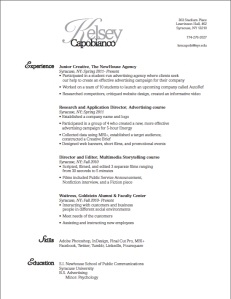
 After making several drafts on InDesign, this is the outcome of my work. I chose to keep my resume simple. From the text choice to the positioning of the text, everything flows in a manner in which my audience can understand while skimming a resume. I did not use two columns of text because I feel like it becomes too busy and less fluid. The voice of my resume is simple and organized. My personality is usually very loud, but I was struggling with creating a loud voice that seemed professional. Therefore, I chose to reflect my organizational skills in the resume. I am in the process of gaining more experience in which I can add to my resume. Until I feel it is suitable enough to use for a profession in the advertising field, my target audience is appealing towards on campus activities, such as magazines and those who are looking to advertise for their organization. My design strategy was to maintain a simplistic layout while showcasing the experience I have acquired thus far. I am going to continue to expand and reform my resume with the new skills I have learned to perfect its presentation.
- Comment
- Reblog
-
Subscribe
Subscribed
Already have a WordPress.com account? Log in now.
Kelsey,
I really like the way you used the cursive script font–its a very flowery font, but by using it just in your first name and the first letter of each header, it isn’t too much. It has a very classy look to it which I think will attract employers. The only thing I can think of that I would change is take the spaces out of your contact information; it just doesn’t seem to line up right. Everything else looks great though!
-Caroline Castro
Kelsey,
I really like how in your wordmark you made it so Kelsey and Capobianco came out to be the same length. With the very script-like K, I feel the wordmark really grabs the readers attention first which is exactly what you want when somebody is reading the resume, but while still maintaining a very simple structure. You succeeded in keeping very simple with your design throughout the entire resume, and didn’t try to distract or impress the reader with a different layout in your body text. I feel that someone reading this resume would have no trouble finding what they were looking for. That being said, I do agree with Caroline concerning your contact information. I feel like keeping it together would be less distracting for the reader’s eyes when reading the page. But overall a very nice job.
Brian Grove