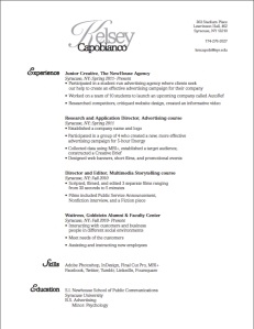
 After making several drafts on InDesign, this is the outcome of my work. I chose to keep my resume simple. From the text choice to the positioning of the text, everything flows in a manner in which my audience can understand while skimming a resume. I did not use two columns of text because I feel like it becomes too busy and less fluid. The voice of my resume is simple and organized. My personality is usually very loud, but I was struggling with creating a loud voice that seemed professional. Therefore, I chose to reflect my organizational skills in the resume. I am in the process of gaining more experience in which I can add to my resume. Until I feel it is suitable enough to use for a profession in the advertising field, my target audience is appealing towards on campus activities, such as magazines and those who are looking to advertise for their organization. My design strategy was to maintain a simplistic layout while showcasing the experience I have acquired thus far. I am going to continue to expand and reform my resume with the new skills I have learned to perfect its presentation.
Kelsey Capobianco: Post No. 1
19 SepLauren Duda: Post No. 1
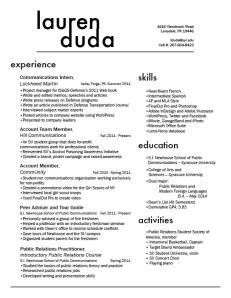
17 SepHere is my resume—a proud product of many hours of work on InDesign. My personality is very bubbly and happy, but if my design was entirely based upon these emotions, it would hardly be appropriate for a professional resume. So, I designed one that reflected my diverse interests, but was also professional. I am a public relations major, and so my target audience would be a potential employer at a public relations agency, firm, or corporate communications enterprise. Public relations practitioners tend to be very clean-cut and well put-together, and so I wanted to create a resume that reflected that. This was essentially my design strategy. I knew I had a lot of content, and my main concern was devising a spatially conscious way to include all of that. By using sans serif fonts I eliminated excess font clutter, and I avoided confusion by using larger headers for each section. My wordmark also reflected my desire to remain clean-cut and creative. For this, I used Futura font and added tracking between the letters in “Duda” in order to perfectly line up my first and last name.
Looking forward to seeing your other resumes,
Lauren D.
