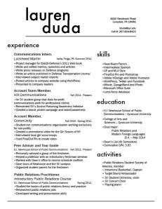
Here is my resume—a proud product of many hours of work on InDesign. My personality is very bubbly and happy, but if my design was entirely based upon these emotions, it would hardly be appropriate for a professional resume. So, I designed one that reflected my diverse interests, but was also professional. I am a public relations major, and so my target audience would be a potential employer at a public relations agency, firm, or corporate communications enterprise. Public relations practitioners tend to be very clean-cut and well put-together, and so I wanted to create a resume that reflected that. This was essentially my design strategy. I knew I had a lot of content, and my main concern was devising a spatially conscious way to include all of that. By using sans serif fonts I eliminated excess font clutter, and I avoided confusion by using larger headers for each section. My wordmark also reflected my desire to remain clean-cut and creative. For this, I used Futura font and added tracking between the letters in “Duda” in order to perfectly line up my first and last name.
Looking forward to seeing your other resumes,
Lauren D.

Hi Lauren,
I love your resume, I think it’s so clean, simple and well-organized. The only thing I would say to do is try to line up the lines that connect your first and last name, they’re just slightly off. But other than that, it looks fantastic!
– Christina Fieni
Lauren,
Even though you wanted to create a more professional look rather than fully highlighting your bubbly personality, I actually think you captured the best of both worlds. Structurally, the resume is very clear to read. Each section is titled with a bold typeface and evenly spaced out and aligned. The use of bold and italics within each category in the experience section makes your position and roles eye-catching when skimming over the resume. I think you managed to capture some of your personality through the recurring theme of using lowercase letters. Connecting the letters in your first and last name give the wordmark a subtle quirky twist while still retaining a structured and professional appearance. I had the same thoughts when I made my resume about mixing my out-of-work personality with my professional self, so I also agree that a sans serif font for the content is a sufficient way to clearly display the important meat of the resume. Good job!
Devon
Lauren,
What impresses me a lot about this resume is that you found a way to cram so much body text and so much information into it, but without making it look cluttered. I think using the sans serif font in the body was a smart move and in the end it turned out looking great. I also think your wordmark effectively displayed your bubbly personality with the lowercase type as well as the connecting ascenders and descenders. The only thing I would change about the resume is trying to create a bigger separation between your left and right column of body text. You could put another line like you have in your wordmark or you could maybe just move the text boxes around in InDesign. That being said, you have a whole lot of text and I think you did a great job on fitting it all on one page in an effective design. Great work!
Brian Grove