Archive by Author

Lauren Duda: Final Post

4 Dec

This class has immensely helped improve my skills in graphic design, as well as my confidence in learning software. Despite the long hours of work outside the classroom, I really did learn an awful lot from this class. I learned how to choose a typeface so that reinforces my idea, and I also learned how to more efficiently design a page so that it highlights the content. I think this will help me in the professional world, because if I ever have to work with a graphic designer on a project, I now know the correct terminology to use to describe what I want. In addition, I also know I cannot tell them to “have it done by tomorrow morning,” because, as I learned from this class, most of the time tat isn’t feasible. In terms of everyday life, this class has changed my attitude toward type and layout of magazines, television ads, etc. I now pay much more attention to it and place a much higher importance on it than I ever did before.

LD

Lauren Duda: Post No. 9

14 Nov

For my website, I chose to redesign a local Syracuse non-profit’s website. The organization is called Home HeadQuarters, and it is an organization that covers all of people’s housing needs. They do everything from helping first time buyers in getting loans, to aiding people in avoiding home foreclosure. The range of services is very diverse, which is reflected in the numerous sections on its website. When designing my website, the target audience I had in mind was pretty much any homeowner in the Syracuse area. This is why I used Syracuse colors in my design–to grab their attention and make them feel right at home. I also really wanted to organize the huge amount of information on the original website into a format that users could easily understand and navigate. This is why on my secondary pages I have a main section for the body text and a side section solely dedicated to useful links. Another part of my design strategy was that I wanted to make it feel like buying a house is not as daunting of a task as it may seem, so I used a playful title font in order to create that feel.

LD

Lauren Duda: Post No. 8

7 Nov

As we saw in the Helvetica documentary and have been told numerous times in class, typefaces can definitely help create a mood. If text is used in juxtaposition with an image, it can either enhance or take away from the meaning of that image. For example, if you have a picture of a child playing outside, a novelty font would be more appropriate to go with that image, because it enhances the playfulness and juvenile aspects of the child. The one example of a typeface in an advertisement that particularly strikes me is the simple font that is used in the google commercials. Although it is not an ad on paper, the Google commercial in which the dad is compiling a list of memories for his daughter using Google services is a very moving commercial. I am always particularly struck by the font used when he signs his collection: “Love, Dad.” The font used is so reminiscent of a Verdana font that we see so often on the computer. This, in combination with the cursor at the end of the line makes it seem like we are looking right into the computer screen of the father, which only makes the commercial even more personal.

Before seeing the film, I must say that I didn’t give much thought to the use or creation of typefaces. I had no idea about the science of creating a typeface– how they evolve, and how some typefaces are limited in their ability to be manipulated because they are based off of previously existing typefaces. However, the one thing that absolutely shocked me was how often Helvetica is used in our world: Verizon, Toyota, American Apparel, Target, and on many subway platforms. I never realized that people made actual professions out of being type designers, or how people used to make a living selling typefaces to companies who wanted to use them. I will never think the same way about type ever again!

LD

Lauren Duda: Post. No. 7

31 Oct

HBO GO

The key to why this website is so good is that it highlights the content in a very obvious way. HBO Go is a media and video content website, and it very effectively displays this through the main content bar in the middle. The logo is in the upper left hand corner, which is where the eye tends to look first when we look at a page. Additionally, the interactivity of the content keeps viewers interested, as does the lack of  text on the homepage. In addition to the main content, it also has secondary visual content towards the bottom, which further keeps the user on the site, because with only one click they can explore all of this media. Additionally, it has 8 tabs, which is well within the 5-9 limit. This website will inspire my own design because I also want to have a main frame of visual content in the middle of my design. This will keep users engaged and keep the page interesting for the audience.

LD

Lauren Duda: Post No. 6

24 Oct

For my project, I chose to do a poster for the Pennsylvania chapter of the SPCA. Essentially, it is an organization based out of Philadelphia that takes in abandoned and abused animals, treats them, and tries to find them new homes. The event that I am advertising for is their annual “Good Dog Gala, Bad Dog Ball,” which is a large, fancy fundraiser for the organization. Each year, the gala consists of a full dinner, an awards ceremony, and a speaker. This is then followed by an after party ball that has cocktails, games, prizes, and a dance floor. Tickets are expensive, as it is a formal event, so my target audience was adults that can afford to pay the expensive price for the tickets. My design strategy was to attract this public through the use of colors and an images associated with a more sophisticated, adult event. I chose darker colors that would be associated with a swanky evening event, and an image that most adults find familiar. However, I also wanted to convey the purpose of the organization within the poster, and so I added the dog bone in as the “stir stick” in the martini glass.

Lauren Duda: Post No. 5

15 Oct

For my advertisement photo, I chose this one from a European advertisement campaign advocating safe driving. This is only one part in a series of similarly designed, equally powerful advertisements. This one in particular features a man who has been injured in a car accident, but this is an image that we usually don’t see. We always see the damaged car, but never the person. That is precisely why this photo illustration is extremely affective: because it is so different from the norm. I do not think it would work any better in black and white, specifically because the colors are already fairly neutral. Obviously this is a manipulated photo, but I think it exactly serves the purpose of the campaign: to shock the viewers and leave them with an image they won’t forget. The photo illustration even further cements the impact of the tagline: “Without a seatbelt, a crash can be deadly, even at 20 mph.” Overall, I think it is a really great photo advertisement that clearly expresses the intent of the advertisement and enhances the slogan.

LD

Lauren Duda: Post No. 3

2 Oct

Hello everyone!

For my advertisement, I chose this ad by Pepsi. Initially, it was very appealing to me because it conveys the company’s message entirely through imagery. As we can see, there is no major tagline here, just the simple “The Joy of Pepsi” logo in the lower right hand corner. The image itself tells a story, and yet it is so simple. The straw going into the Pepsi can is just a typical, normal straw, but the straw going into the competitor’s (Coca Cola’s) can looks as if it is screaming and struggling to go into the can. This visual is humorous, but it also catches the viewer’s eye and conveys the message that Pepsi is the better soda. I think this will definitely inspire me to use images to tell the story in my poster design, as opposed to words.

Looking forward to seeing some other choices!

LD

Lauren Duda: Post No. 2

25 Sep

Why it works:

With its logo, FedEx achieves the goal of any great logo: to convey the company’s message as succinctly and creatively as possible. First, it grabs the viewer’s attention with the color choice. Purple and orange are complementary colors on the color wheel, and the difference catches the viewer’s eye without clashing the colors. Second, the tracking in between letters is almost negligible, which creates the effect that the company ties everything up in one neat, easy-to-maneuver package. Lastly, the most important thing that the logo does is effectively utilize white space. If we look closely, we can see that in between the letters “E” and “x” there is an arrow. This certainly illustrates that the company aims to be fast and get your shipments moving in the right direction. For a mail company, this is certainly a message that should be stressed to its customers.

Why it’s sub-par:

This logo, albeit eye-catching, is not a very good one for several reasons. Although the text does convey a metropolitan impression, the weight of it is rather thin, which does not exude the feeling of confidence that a bank should convey. In addition to this, the text is a bit unbalanced. The “New” is attempting to support the “Bank of” above it, but in the process it becomes misaligned with the words “The” and “York.” This creates a very haphazard feeling in regards to the word placement, and as a result it looks a bit jumbled. However, perhaps the most detrimental thing is that this logo lacks some sort of graphic. A graphic would make the logo a bit more interesting and would allow for viewers to associate the company name with an image. This, in turn would lead to more effective branding for the company.

Bonus:

Given the fact that we are in a graphic design class, I thought that these business cards would be appropriate to share. They belong to a graphic designer named Huong Le. With his personal logo, Le did a great job of conveying who he is to the public. The very minimalistic “HL” paired with the circular background creates a very geometric feel that harkens back to the famous Bauhaus movement. In addition, the lime green color of the circle gives off a very “fresh” vibe that conveys a distinct sense of style, as well as an influx of new ideas. The overall look of the card is very clean, which makes it easy to spot who he is, what he is about, and how to contact him.

–Lauren D.

Lauren Duda: Post No. 1

17 Sep

Hello all,

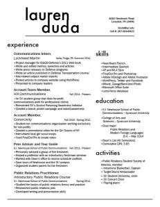
Here is my resume—a proud product of many hours of work on InDesign.  My personality is very bubbly and happy, but if my design was entirely based upon these emotions, it would hardly be appropriate for a professional resume. So, I designed one that reflected my diverse interests, but was also professional. I am a public relations major, and so my target audience would be a potential employer at a public relations agency, firm, or corporate communications enterprise. Public relations practitioners tend to be very clean-cut and well put-together, and so I wanted to create a resume that reflected that. This was essentially my design strategy. I knew I had a lot of content, and my main concern was devising a spatially conscious way to include all of that. By using sans serif fonts I eliminated excess font clutter, and I avoided confusion by using larger headers for each section. My wordmark also reflected my desire to remain clean-cut and creative. For this, I used Futura font and added tracking between the letters in “Duda” in order to perfectly line up my first and last name.

Looking forward to seeing your other resumes,

Lauren D.