Archive by Author

Kelsey Capobianco: Final Post

5 Dec

When I first entered this class, I had no previous knowledge of anything graphics-related. I was nervous because I was under the impression that everyone else knew exactly what they were doing. I may not have have previous experience, but I can honestly say that I have learned a great deal from this class. I’m proud of each project I’ve put together.

This class has made me love designing. I’m not the best at it, but I still find it fun to construct posters, websites, etc. I can also say that this class has made me pay attention to detail. I never thought about font choices before I took this class. I am aware that some fonts are more powerful than others, but I never knew how much time is spent choosing the right typeface.

I find myself constantly praising and critiquing elements of design. Each element of a project must fit together in such a way that will attract the attention of the target audience. I am excited to take my new eye for design into the real world.

I also have a greater appreciation of different graphics projects. I understand how time consuming they are.

-Kelsey

p.s. Rasterizers for life!

Kelsey Capobianco: Post No. 9

14 Nov

Rebuild Worcester Together is a division of a large chain of nonprofits that are geared at rebuilding the community. The organization gathers volunteers from the surrounding area to work alongside skilled tradesmen to make a difference in people’s lives; especially families with children, the elderly, and people with disabilities. This organization is all about lending a helping hand. My target audience consisted of people who want to help their community. This is a very broad selection to work with, so I chose to use pale blue for the back. I consider this color to be very neural for anyone who would come across this page. I also chose to make the color scheme consistent with the logo opposed to all black and white, like the original website. My design strategy was to use bright colors and a simple design to appeal to the younger generations. It’s important because they will be the one’s who will be helping the community in the years to come, so they should be aware of the opportunities they have to help people in their own neighborhood. The font is sturdy yet pleasant, keeping people at ease when they view the site. It’s simple yet effective.


Kelsey Capobianco: Post No. 8

7 Nov

I never really thought about typefaces before I came to this class. I mean, sure, different signs say different things, but I never really considered the emotional response I had towards it. Typefaces can make the word say a great deal. Typing a word is one thing, but when you add boldness, thickness, or any other small detail, the entire meaning can change. The font can appear LOUD or quiet. It can appear strong or fragile. The simplest of changes can make a word speak volumes. A typeface can trigger an emotional reaction by resembling something that has been seen before. As for the second part of this blog, I can’t really think of an instance when I reacted solely to a typeface because I have never really paid attention to them. Now that I’m more aware of their ability to evoke emotion, I’m sure I’ll be focusing more on the choice of typeface in various designs.

The film made me realize how intense people are about choosing the proper typefaces. One guy was laughing at the list of words because they had no pizazz. This film made me think of the power one can have simply by choosing the proper typeface. I never thought of words as a picture until after I saw this movie. I’m never going to use comic sans again as long as I live, I can tell you that much. I never realized how important a typeface is when designing… anything. Designing the image is only half the battle. A designer needs to make sure to compliment their image with the proper text. I’m slowly learning how to do this, and I hope that I will continue to improve on this skill.

Kelsey Capobianco: Post No. 7

31 Oct

http://www.RECWorcester.org/

I think this website is well executed, especially because so many localized nonprofits do not put a lot of time into their sites. This website is good because it is easy to navigate, clean cut, and not over crowded. The home page gives enough information for the user to figure out what the website is for without bombarding them. The grid created by the text and pictures looks very clean cut. I approve of this because the organization is about keeping the environment clean. The color scheme is not invasive and is consistent throughout the website. The navigation is extremely clear and they provide enough information to search around the site. The clickable links are also consistent on the homepage. It is understood that all of the titles are interactive and will bring the user to different locations.

This website inspires me to create a simplistic website with clear navigation. The most important information is clearly and readily displayed on the homepage and I think this is the best way to get a positive response from the user. I like the use of images on the homepage. It creates a personal feel and evokes an emotional attachment to the nonprofit.

Kelsey Capobianco: Post No. 6

24 Oct

This event called Out of the Darkness Walk is a walk put on by the American Foundation of Suicide Prevention to raise awareness of the severity of suicide. TWOLHA is also sponsoring this walk where they will have merchandise available for purchase. The target audience I chose to appeal to is the teen to young adult category. I felt this would be the easiest target audience to appeal to because of the preexisting reputation of the TWLOHA foundation. Most of the participants are in said age range. My design strategy is edgy, sharp and bold. I chose to focus on these key elements with the shapes, primary images and color choices. I felt that the candle in the center gives off a feeling of hope and support while also avoiding the cheesy aspect of bringing light into someone’s life. The shoes are also different because I chose to use pieces opposed to the entire image. This creates a more enticing design because it gives the viewer freedom to fill in the rest of the design. My typefaces are bold and tight together, imitating the logo. Also, the elimination of space between the headlines gives the illusion of support and togetherness.

Kelsey Capobianco: Post No. 5

17 Oct

This advertisement for Dolce and Gabbana can be seen as highly controversial. This fashion company chose to represent their image with sexual imagery and male domination. This advertisement’s primary image shows the objectification of women to a very large degree. This ad can be seen as controversial due to the fact that the men are all standing around a women, scantly dressed, while she is pinned to the ground. The woman is lying in a sensual pose which is very suggesting to the audience. This image would probably not have the same visual affect in black in white, because the skin colors are very warm, which perfectly contrast the cool colors in the clothing. This image was manipulated most definitely. The shape of the models was photoshopped to their liking as well as creating a glisten on all of their bodies. This glisten further adds to the sense of lust portrayed in this advertisement. Personally, I think this advertisement is not good. It does not portray a positive message, especially towards the feminist viewers. Also, being the most unfashionable person on the face of the planet, I had no idea what this ad was selling. I’ll work on that though.


Kelsey Capobianco: Post No. 4

10 Oct

My design choice was inspired by my own personal opinions. When I meet someone, the first feature I notice about them is their eyes. The eyes tell a great deal about a person. When people look at my personal logo, I want them to sense the personal feeling that I am trying to get across by creating a face. I hope that people will see it and feel comforted, not overwhelmed. I chose to design my logo in this manner because I want to feel like a person, and not just a worker looking to expand connections. The color gave me a great difficulty, and I am still not sure if I am happy about it. I originally used a light green, because my eyes are green. However, the color of my eyes is muted so the green did not accurately represent me. I chose a gray-green color because I felt it was more accurate. I don’t know if I stand by my choice because I think the green would have been more noticeable. The typeface was chosen in order to contrast the handwritten KC in my logo. The contrast creates a good sense of profession while still feeling organic.

Kelsey Capobianco: Post No. 3

4 Oct

I think is advertisement is very clever. Instead of overwhemling the target audience with imagery, the creative team chooses a simple image. Standing alone, this image would mean nothing to the viewer. However, with the addition of the price tag, the meaning changes all together. I think this advertisement is very effective because it is an appropriate and unique approach to selling condoms. Instead of appealing to the sensual feelings, they portray what could happen as a result of not buying the product. This poster inspires simplicity. I do not think that the audience needs to be bombarded with a large number of crazy graphics to be effective. Sometimes, the simple things are more memorable. My poster is going to focus on one main image and, with a little tweak, it is going to project a different meaning, like this durex advertisement. This advertisement is creative, comical, and simple.

Kelsey Capobianco: Post No. 2

26 Sep

1. I feel that the Volkswagen logo is a perfect example of a well executed company design. The simple, organic shape eludes to the curves of the car while the inner portion can represent the ‘sharp’ interior. They do an excellent job incorporating the initials of the company into their logo while cleverly disguising them. The letters are very subtle and fit together well. The logo is visually appealing because of its simple design on paper and, when transferred to the cars, it becomes very classy and sleek. I think this logo is well designed not only because of the incorporation of the initials, but of the simple color scheme they chose to use. The white symbol stands out on the blue background without being too overpowering.

2. Don’t get me wrong, I absolutely LOVE Disney movies, but lets face it, the logo isn’t all that great. The only reason this logo has not undergone an image change is because it is already so well established with its target audience. Any change would just infuriate everyone, due to its timeless nature. However, I think this is a bad logo because, up until about age 10 (give or take a few years) I had absolutely NO idea that the first letter was a D. It gives off a cute and whimsical tone, but it is very hard to determine what it is; especially for the little kids which it is directed towards. Even to this day, I forget that the first symbol is a letter, because I spent so long assuming it was just a swirl. The logo is cute, but difficult to read.

3. This business card is so creative because, by tearing along perforated line, it becomes 2 separate cards with identical information. This is both creative and effective because, not only is a divorced couple is trying to separate from each other, but because the single card can function for both members of the divorce.

Kelsey Capobianco: Post No. 1

19 Sep

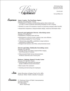
After making several drafts on InDesign, this is the outcome of my work. I chose to keep my resume simple. From the text choice to the positioning of the text, everything flows in a manner in which my audience can understand while skimming a resume. I did not use two columns of text because I feel like it becomes too busy and less fluid. The voice of my resume is simple and organized. My personality is usually very loud, but I was struggling with creating a loud voice that seemed professional. Therefore, I chose to reflect my organizational skills in the resume. I am in the process of gaining more experience in which I can add to my resume. Until I feel it is suitable enough to use for a profession in the advertising field, my target audience is appealing towards on campus activities, such as magazines and those who are looking to advertise for their organization. My design strategy was to maintain a simplistic layout while showcasing the experience I have acquired thus far. I am going to continue to expand and reform my resume with the new skills I have learned to perfect its presentation.