Archive by Author

Heidi Chu: Final Post

4 Dec

Before I took this class, I was clearly oblivious to all the efforts put into the graphical elements in the products of this world. I knew that different types of typefaces made different effects on its audience, but I didn’t realize how there are so much more graphical elements put into a design to properly and effectively present a message. Now, I see the efforts of designers in their products in every ad , website, and poster I see.

Although I clearly still have a long way to go if I were to become anything related to a graphic designer, I now realize the difficulties that the job entails and the motivation of perfection needed to graphically design the perfect message.

As a Public Relations major, I would obviously be working closely around graphical elements to create an image for various types of clients. Through the basics that I’ve learned thus far, I’ll hopefully be able to use graphics to accurately present a client in this digital world.

Heidi Chu: Post No. 9

14 Nov

My organization was the Juneau Raptor Center, which is a local non-profit located in Alaska. It is dedicated to the well-being of all birds and provides aid and treatment to birds that are injured or sick. My target audience was a large range from bird-lovers to high school volunteers. There were several reasons why any person would’ve entered this site. Some reasons would have been to find out more about the organization, learn ways to volunteer, or to learn more about birds for personal research. Since this site offered such varieties of information, I wanted to create a design that allowed the user to easily navigate through the website and to find the information and answer he/she was looking for. The original site only had hyperlinked text for navigation, but I wanted to add graphically pleasing links to guide the user. Lastly, I used typefaces that were easy to read.

Heidi Chu: Post No. 8

7 Nov

In so many ways, typefaces definitely create a mood, feeling, and image. Thin typefaces can present a more professional or lighter feel, whereas thick, bold typefaces would exhibit a more declarative, strong feel. Serifs also make a difference–serifs can show a more traditional feel whereas san serif fonts tend to be more modern. There have been many times where I have seen a print ad, or opening credits to a movie and have thought about how perfect that typeface fit with the specific image or message it was attempting to portray. Usually, the typefaces that I noticed were more modern–they were sending out a message for fashionable clothes or for a movie starring teen heart throbs. Furthermore, I feel that typefaces definitely make a difference when used in novels, or even textbooks. Depending on the typeface used, the user can automatically think out the difference between modern, contemporary works to ancient, old ones.

Through the film, I have come to realize that developing fonts are so much more complex. Furthermore, they are bigger part of our daily lives than anyone truly realizes. When the movie showed how typefaces were created by the different artists, I realized that the details of each letter, of each curve of every loop were extremely important when creating those typefaces that make that specific mood, feeling, and image. Furthermore, the movie has made me realize how important typefaces are when using them in print–different typefaces present different feels, thus attracting different audiences.

Heidi Chu: Post No. 7

31 Oct

http://thesupply.org/

In general, a good website should have easy accessibility. A great website should have a graphically strategic design to captivate their audiences while also providing simple usability for the user to navigate around the website. The supply’s website, built for a non-profit organization to provide education in third-world countries, does just that. Their homepage is based on an image with a short layer of text and navigational links on top. The reason why this website is not only good, but great, is because the homepage is the only page. In other words, the navigational tabs don’t actually take the user to a different page, but it either drops down to show its content, or a viewer pops out and shows the content instead. It is obvious that the website utilizes a lighter graphic tool for the page to load much quicker, and for the user to navigate through the website in a quicker, more convenient way.

Heidi Chu: Post No. 6

23 Oct

My event was a walk to bring out awareness about Autism supported by the non-profit organization call Walk Now For Autism. To bring out awareness, I thought that the main target audience for my poster should be students and parents, especially those who are affected by Autism. To attract my audience, I made a light blue poster with a simple message that taught the viewer a simple way of understanding a glimpse of what Autism really is: I made two faces with different expressions and explained that Autistic patients have difficulty differentiating the two. Furthermore, I designed a statistic that also informed my viewers about the importance of bringing out the awareness of Autism and the value of raising funds to find the cure. Lastly, I included the date, place, and a website to go to for more information and registration. To add a final graphic element, I designed a subtle divider between the event information and the information about Autism with footprints.

Heidi Chu: Post No. 5

19 Oct

The poster I chose was one of a shampoo that claimed to provide extra volume. This message is clearly portrayed through the heightened hairstyle made by the foams of the shampoo. In an obvious sense, the photo has been manipulated because, for one, it is impossible for hair, or even shampoo foam, to be perfectly styled as the image shows. In addition, the flawlessness of the model also indicates manipulation of the photograph. I don’t think that this particular ad raised any controversies because it has somewhat of an innocent feel to it. However, if there were to be any kind of controversy, it would be that the model was photoshopped a bit too much to the point where her body reached a slight deformity. Lastly, I personally think that the color choice works well with what the shampoo ad is meant to portray. If it was in black and white, I think it would have been a less effective ad.

Heidi Chu: Post No. 4

9 Oct

For my logo, I was trying to present my love for music and my hopes for its role in my future. I used two shades of blue and used them consistently throughout the project. I chose those shades because I thought the pastel tone fit well with my personal taste. I formed my logo by creating a volume indicator image by replicating rectangles and stacking them up in descending heights. I, then, bordered it with a soft cloud. In a slightly obvious sense, the volume indicator represents my interests in music  while the cloud borders my hopes. Furthermore, I chose the font because I felt that it fit well with the cloud shape I incorporated in my design. I hope that my design portrays myself as someone with potential and with creativity.

Heidi Chu: Post No. 3

3 Oct

I’ve always loved Nike’s posters and advertising because they’ve always given an edgy inspirational presentation that has also made the audience think a little. In the poster, it reads, “just a t-shirt the way Sofia is just a back-up dancer.” According to their website (http://www.nike.com), Sofia Boutella is a dancer who originated from the streets and fought her way to becoming a dancer for top artists around the world. In other words, she is not just an ordinary back-up dancer, which would make that T-shirt just as extraordinary. By using inspirational athletes to promote their products, I find that Nike not only advertises well, but also gives their viewers a sense of motivation–a valuable plus without any charge. Furthermore, the ad’s colors, content, and extreme contrast in font size inspires me to make a logo can be versatile so that I can use it to promote myself in the future.

Heidi Chu: Post No. 2

26 Sep

1. I feel that the Adidas logo does a fantastic job presenting the company. The classic three stripes played along white and black spaces are almost iconic, while the plant-like formation with the three leaves also leaves an impression. I think that the role of a logo is to relay an image to the company’s target audience so that they could immediately recognized and associate the logo to the company, and I feel like it does just that. If anyone were to pass by and see three solid, diagonal stripes, they would very likely recognize it as Adidas.

2. I think the the logo for the 2012 Olympics in London does not really fit well to its job. The image doesn’t seem to show any representation to London in anyway–the colors seem random and, since the “2”s do not show consistency, I feel that the overall logo is unorganized. I feel like the logo is presenting the Olympics to be a very childish subject, rather than the global event that affects almost everyone on Earth. Also, l think that the logo should present something that London is known for, something London is proud and unique of having. However, the logo presents nothing that promotes London as the country many people love and would like to experience.

Bonus: This is a business card of the company Ground Flight Inc., which sells pressure intensifiers for planes. Since the company’s main targets are plane companies, I found it very entertaining and fascinating that the business card resembled a plane ticket.

Heidi Chu: Post No. 1

19 Sep

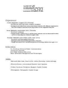
My target audience is within the wide spectrum of corporations, small companies, and even law offices because my interests and goals of the future revolve around the career paths of a lawyer and a public relations practitioner. This is why I wanted to have a professional, dependable voice more than any other; my design strategy was essentially achieving the most neat, business-like resume possible. Rather than a cheerful, or a quirky voice, I aimed for a professional one because that is what I would look for as an employer and professionalism is what, I feel, is most valuable in a resume. So, after multiple versions of my name in ornamental, script, and bubbly typefaces, I eventually ended up with this one. It’s not necessarily artistic, or exceptionally appealing, but I chose it because it was the most formal of all my drafts. Through the typefaces of both my wordmark and my body text, I felt that I achieved a professional voice while also presenting myself as someone with potential and organizational skills.