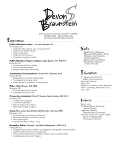
When creating my resume, I played around with a few very different style designs, as it was tough to decide on just one side of my personality to highlight. In the end, my resume reflects a happy medium between my academic and recreational identities, both equally valuable to a potential employer. I see my wordmark as outgoing and relaxed, two qualities most people I encounter immediately recognize about me. With my target audience being public relations firms, I wanted to deviate from the standard, more structured wordmar ks on resumes they are probably accustomed to receiving, so I chose a flowy font and used two different grey scales. However, when designing the substance of my resume, I aimed to emphasize a different side of my personality – the more “getting down to business” attitude I activate as soon as I get into work mode. To display this quality, I choose a san serif font and aligned the different sections using straight thin lines.
I strive to leave a memorable and distinctive first impression with potential public relations employers; thus my wordmark serves as that first impression translated to paper. And just as a job interview confirms ones experience, skills and education, the subject matter of my resume validates my merit for the position in a clear, easy-to-follow format.
Devon, I think this resume looks really good! I like the light-hearted font of the wordmark, as well as how you maintained the first-letter capitalization throughout the section headers–it creates a nice fluidity and consistency throughout the entire piece. The organization is very good as well, and the lines are very clean. I also think you did a good job of mastering the balance between personality and PR decorum that we need as PR majors! The wordmark is just enough to pleasantly capture your eye without being too over-the-top. The only thing I would think of to change is I’d maybe remove the middle initial from your wordmark, since your last name is already kind of long.
Other than that, though, looks great!
–Lauren D.
I absolutely love your wordmark! The typeface is, like you said, outgoing and relaxed and I feel as though it conveys that you are not just another PR student. I like how you incorporated your wordmark in your resume through the headings. The overall layout is clean, concise and easy to read. One minor adjustment that you might consider doing is adding a little more space between your contact information and the line extending from the bottom of experience. I also would be consistent with the bullet points and put them in your education and honors section. Nonetheless, I feel like this is a very strong resume because it would definitely stand out. You made good use of the page and there are no awkward white spaces woven throughout the body. From what I can see, your content typeface is easy to read and contrasts nicely with your watermark. Good job!