Archive by Author

Devon Braunstein: Final Post

4 Dec

Taking graphics was definitely very beneficial for me in terms of my work and other aspects of my daily life. My new familiarity with the Adobe Creative Suite will come in handy for a tentative career as a public relations practitioner. I’ve already found it useful for things outside of class projects, like PR campaigns and creating logos. I also have gained a sense for design and would consider myself a legitimate judge of what looks good and what doesn’t. As Darren told us in the beginning of the semester, it is important to have an understanding of the workings behind design: the time, the creativity, and the tediousness. During my internship last summer for a PR, marketing and advertising firm, I witnessed first hand the conflicts within a work environment that can arise from a misunderstanding of the graphic design process. Taking this class has given me valuable insight and knowledge of a job that affects almost every company or profession, thus it will give me an advantage when I apply for jobs or internships in the future. The class also challenged me with assignments that were out of my comfort zone, making me a stronger student overall and teaching me the benefits of accepting constructive criticism.


Devon Braunstein: Post No. 9

14 Nov

Theater for the New City (TNC) is a not-for-profit theatrical organization that produces plays and hosts events. Many of the productions are written by emerging young playwrights or multi-ethnic/multi-disciplinary theater companies without a permanent home. TNC aims to encourage future theater artists from low-income minority communities of New York City by producing minority writers from around the world and engaging the community with theater through free festivals. It has won several awards lauding its high-quality productions. My target audience is general city-goers of New York who support the program by attending and funding the shows and events, in addition to emerging young playwrights and residents in lower-income communities. I used the bold red curtains against a black background to portray the organization’s professionalism and reflect its high-quality productions. The darkness against the curtains gives off a nightlife ambience to associate the website with a NYC theater event. I didn’t want to make it too fancy because of the rawness and uniqueness that the individual playwrights bring to the table, as they come from all different diverse backgrounds. The white type on black background creates clarity in my design while keeping it simple enough to not scare away up and coming playwrights who may not yet be aware of the extent of their talents.

Devon Braunstein: Post No. 8

7 Nov

Each typeface has its own unique look to it, thus conveys its own tone or personality depending on its appearance. Serif fonts come off as book-like and old fashioned; hence I wouldn’t choose to use a serif font for something modern or innovative. On the other hand, sans-serif typefaces seem lighter, more relaxed, and modern. They also are more flexible and can be used in a variety of circumstances, just as Helvetica is comforting and appealing in many different designs, from American Apparel to bathroom signs. For example, I used similar sans-serif fonts for the resume project and for the poster project. The sans-serif typefaces served completely different purposes depending on the context they are put in. In the beginning of the year when we learned about typefaces in class, Darren showed us words in typefaces inappropriate for their meaning. When I saw a graceful, flowy word like “ballet” typed in a blocky, intense typeface, I immediately had a sour reaction because of the contradicting strong mood of the typeface with the actual meaning of the word.

The film definitely made me more aware of corporations’ frequent use of Helvetica and the reasons why they choose it. I agree that Helvetica is a universal font that makes text look friendly and approachable. I thought it was interesting that big corporations use Helvetica for the purpose of making themselves seem more open and one-on-one. The film taught me that typefaces can be used for purposes other than just visual appeal; they can be chosen to convey a specific tone or mood for the company’s benefit. I now take notice of the font choice in every sign and design I observe and think about the creator’s intentions when choosing the fonts.

Devon Braunstein: Assignment No. 7

31 Oct

https://www.thebeneficial.com/index.asp

Beneficial Bank, a bank in the Greater Philadelphia area, has a great example of a quality interface design. The first thing I notice on the website is the consistent design. The website uses two different typeface families throughout the entire layout: a fun font for the display heads and titles and then a simple sans serif font for the important information. It contains a hierarchical grid with a display head and logo at the top, a navigation bar with consistent hover appearances, a welcome screen with basic information, and a secondary navigation bar. When visiting secondary pages, the hierarchical grid is the same so it is clear what to click to locate the information they desire. The design as a whole has a modern look to it because Beneficial Bank is a relatively new bank appealing to an audience that doesn’t want to deal with a corporate company. The bright colors make it appealing to an audience looking for something new and welcoming. The simple yet fun layout inspires my own design because I hope to utilize a color scheme to set a tone for the target audience while making sure my site is consistent and easy to navigate.

Devon Braunstein: Post No 6

24 Oct

The “Dive Against Debris” is a dive in the coral reefs on the coast of California to clean up litter in the ocean. The event is exclusively for the Professional Association of Diving Instructors, so the target audience for the poster is professional divers. To attract the attention of the target audience, I chose a pun that would reach out to the common knowledge of scuba divers in a humorous way. I used the phrase, “Keep your friends close but your anemones closer” because divers are familiar with the oddly close relationship between the clown fish and then anemone. My goal was to personify creatures that live in the ocean to give divers an incentive to participate and encourage them to want to clean up the coral reefs. For my graphic, I created an anemone out of several individual shapes to keep the design simple and clear. I didn’t feel the need to include an actual clown fish because an audience so familiar with undersea life is able to use the Gestalt Principle and associate the pattern of the clown fish with the actual fish.

Devon Braunstein: Post No. 5

17 Oct

This advertisement for MAC make up products displays a clear message through the use of a photo intermixing pink make up products with cupcakes and colorful sprinkles. The ad makes viewers associate the make up company’s line of products with sweet desserts, promoting the line’s delectable looking color scheme and sugary scents. The use of color is important in the ad because it visually connects the cupcakes with the makeup. Without color, the products would look random and out of place and the image wouldn’t capture the same sugary quality. The image was most likely manipulated in order to avoid a messy photo shoot with icing getting all over the make up. However, an image created with less or even no manipulation might be an even more effective advertisement because it would look more natural and fun, rather than superficially placed. A key audience for these products is young girls, so creating a messier, more natural-looking scene might remind viewers  of a specific funny moment they experienced with friends, consequently connecting them to the product on a personal level.

Devon Braunstein: Post No. 4

10 Oct

For my business card and stationery set design, I created a professional logo to represent myself as a public relations professional. My logo is an exclamation point made out of rays of light to represent bright, new and innovative ideas. The exclamation point portrays excitement, as I want each of my potential clients to be aware of my enthusiasm toward each and every project. I constructed the logo out of bold shapes to convey reliability and order, two crucial qualities for a public relations professional.

I only incorporated two colors in my design: gold and black. To depict the rays of light, I chose a darker shade of yellow that isn’t as hard on the eyes as a bright yellow. The gold shade also makes more of a statement, as it contrasts with the white background and black text.  The black typeface displays the information clearly without detracting from the logo, yet because of the thickness of the font, it isn’t lost next to the gold image. I used a font called Bell Gothic Std because it compliments the logo without acting as a distraction. It is consistent with the qualities of reliability and clarity I convey throughout the design, as it is bold and easy to comprehend. It also looks modern because of the lack of serifs.

Devon Braunstein: Post No. 3

2 Oct

I find this ad for ASPCA great because it is both visually appealing and clever.  I like the use of a large photo cutout against a plain white background – it clearly defines the main focus of the page and gives the ad a fresh and modern look. There is no busy, over-the-top text that would distract from the main message of the ad. The color of the logo and tagline is bright enough to catch the viewer’s attention, but not uncomfortably bright that it’s difficult to look at. I like how the image relays a message within itself through the use of speech bubbles to represent voice. As for my poster design, I plan to use a large cut-out photo as the main focus, just as this ad uses the  cutout of the dog and cat against a white background. I am a big fan of simplicity, thus admire the crisp, cleanliness of the ad and subtle color scheme.

Devon Braunstein: Post No. 2

26 Sep

1. The Facebook logo is very effective. According to the Gestalt Theory of Perception, when we look at an image, we see it as a whole rather than as individual pieces. When you look closely, the Facebook logo is made up of a square, a half circle, a rectangle and an “f.”  As a whole, our eyes go toward the white “f”, relating to the figure/ground principle. The background of the logo is a few different shades of blue, so the negative white space used for the “f” makes it stick out as the main feature, letting the viewer know that the logo is for Facebook. The logo is also simple, as it is made out of basic shapes, yet creative, as it appropriately resembles a key from a key board. It also has a modern look to it from the rounded edges of the rectangles, a characteristic that embraces the innovative quality of social media.

2. I found this logo for a girls lacrosse trainer online. I don’t think it’s a good logo for a few reasons.  First, there is too much going on. The use of the shape of a rhino for the “R” is a creative concept, however, when matched with the word “lacrosse” going across the bottom of the word, plus the orange shape above the letter, it is way too busy. My eye doesn’t know where to look first and it isn’t clear to me what the orange shape actually is. Also, the colors are nice, however, they don’t come off as intense, sporty colors that I would think to use to create an image for a hardcore lacrosse training program. A rhino has the connotation of being tough, yet the colors used are light and peaceful, both qualities I wouldn’t relate to an aggressive sport like lacrosse.

Bonus:

I’m a big fan of this business card – it has a catchy logo that utilizes negative space, plus it uses a typeface that gives the business a distinct edgy  personality. The information is clear and easy to locate, and the bold words let the reader know which information is most important.

Devon Braunstein: Post No. 1

19 Sep

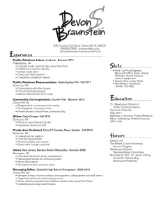
When creating my resume, I played around with a few very different style designs, as it was tough to decide on just one side of my personality to highlight. In the end, my resume reflects a happy medium between my academic and recreational identities, both equally valuable to a potential employer. I see my wordmark as outgoing and relaxed, two qualities most people I encounter immediately recognize about me. With my target audience being public relations firms, I wanted to deviate from the standard, more structured wordmarks on resumes they are probably accustomed to receiving, so I chose a flowy font and used two different grey scales. However, when designing the substance of my resume, I aimed to emphasize a different side of my personality – the more “getting down to business” attitude I activate as soon as I get into work mode. To display this quality, I choose a san serif font and aligned the different sections using straight thin lines.

I strive to leave a memorable and distinctive first impression with potential public relations employers; thus my wordmark serves as that first impression translated to paper. And just as a job interview confirms ones experience, skills and education, the subject matter of my resume validates my merit for the position in a clear, easy-to-follow format.