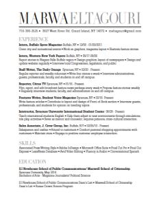
I wanted to create a wordmark and resume that reflected my major: magazine journalism. Upon designing a wordmark I therefore played around with fonts commonly used in magazines, deciding on a large, bold wordmark similar to the title of a magazine on a magazine cover, which would attract the attention of magazine employers, my target audience.
I focused on simplicity for the design strategy, and wanted my layout to resemble the table of contents page of a magazine. I would create bold headers, and keep the page simple yet eye-catching. Through neat organization, my design would ensure that the reader would not need to search for any information. Employers would be attracted by the design’s easy readability and sleek fonts. I knew from past experience that employers become distracted by complex designs, and just wanted the main focus of my design to be content.

Marwa,
I think your resume is so classy and elegant. The first thing I thought of was the cover of a magazine, so I think that you did a great job appealing to the companies you are looking to apply to. The use of grayscale in your wordmark creates a distinct difference between your first and last name without disturbing the fluidity of the page. The square bullets are a nice touch. It is very unique. You filled the page well and created a very nice resume. The only minor suggestion I have would be to make sure that one bullet does not lead the line. That’s all! Great job!
-KC
Marwa,
The reason why I like your resume so much is that it is different than any of the others that I saw in class. Its bold and takes a risk yet still communicates all of your information in an organized manner. It will most definitely grab the attention of employers, especially the type of employers you said you will be looking for in the future. I honestly don’t really have any criticism for this resume…I wish I had organized mine more like this!
-Caroline Castro
Congratulations, you achieved your goal because your wordmark looks like the title of a magazine. I really like how you created contrast in your wordmark by making your last name lighter than your first. Your wordmark is definitely the first thing people will see and you were able to tie it into your actual resume with the gray headers. I like how you bolded your headers and your school because it makes it stand out so the reader doesn’t have to go looking for it. The layout is clean and concise making it very easy to read and/or skim. I also like how your bullets are squares rather than circles. Although it is a small detail, it adds to your resume and helps make it unique. Overall, I really like the layout and how there are no awkward white spaces in the middle. Your margins are evenly spaced making your resume appealing to the eye. Good job!