Search results for 'post no. 1'

Brittany Fowler: Post No. 1

20 Sep

Hey everyone,

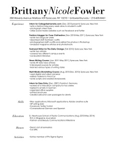
As I was planning how to design my resume I constantly reminded myself that I wanted it to be clear, easy to read, and reflect my personality. Since I aspire to be a fashion journalist, my target audience is the editorial side of the fashion industry. I feel like the typeface for my wordmark resembles Vogue with the varying stroke widths. Since my personality is upbeat and feminine, I italicized my middle name to not only add contrast but also to soften my wordmark. The layout of my resume is simple and clean so the reader remembers the content rather than the design. I feel like the typeface used in the body is easy to read and I linked it to the wordmark by italicizing my headings. Overall, my goal was to create a resume that appears professional with subtle feminine touches.
Roxanne Hesh: Post No. 1

20 Sep

As someone who is easy-going and simple to understand, I created my resume to reflect those characteristics. My word mark is to the point without extra distractions. Instead of creating an ostentatious design, I chose to simply print out my name while varying the boldness of the font between my first and last name, and my middle initial. Originally, I had decided to use Big Caslon as the primary font for the resume. However, Big Caslon is a serif font and eventually I realized it was too serious for my liking. I changed the font to Avenir LT Std because it is simple – yet firm, it is to the point, and it is easy on the eye.  I feel as though Avenir LT Std better reflects my personality, which was the ultimate goal. This resume (if distributed to potential employers) is meant to attract corporate and communications based companies. I am unsure of what the future holds, so the simple design of my resume is appropriate for the “traditional” corporations but it also demonstrates my ability to work with InDesign for the communications-based companies who may be looking for more than plain and traditional.

Chloe Gersten: Post No. 1

20 Sep


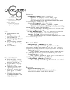
I wanted to keep my resume clean, organized, and simple. My voice is similar to the design–simple, yet professional. I wanted my resume to reflect my laid back attitude, but also show my organization and highlight my experience.  My resume is designed so it can be appropriate for any situation–something I can turn in for either a job at the mall or an internship with a magazine. Each section is clearly denoted and is easy to read. With the two columns, I give myself space to add more and move sections around easily, without losing the organization. The biggest problem I had in designing was a lot of white space. By simply making the margins smaller and decreasing the white space between sections, I can add experience as necessary. This design is not only easy for the reader, but also easy for me to edit in the future.

Marwa Eltagouri – Post No. 1

19 Sep

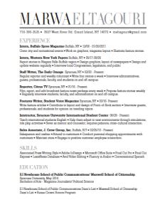
I wanted to create a wordmark and resume that reflected my major: magazine journalism. Upon designing a wordmark I therefore played around with fonts commonly used in magazines, deciding on a large, bold wordmark similar to the title of a magazine on a magazine cover, which would attract the attention of magazine employers, my target audience.

I focused on simplicity for the design strategy, and wanted my layout to resemble the table of contents page of a magazine. I would create bold headers, and keep the page simple yet eye-catching. Through neat organization, my design would ensure that the reader would not need to search for any information. Employers would be attracted by the design’s easy readability and sleek fonts. I knew from past experience that employers become distracted by complex designs, and just wanted the main focus of my design to be content.

Devon Braunstein: Post No. 1

19 Sep

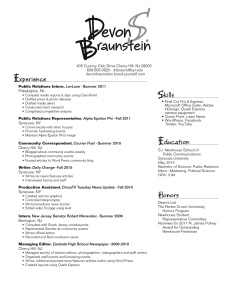
When creating my resume, I played around with a few very different style designs, as it was tough to decide on just one side of my personality to highlight. In the end, my resume reflects a happy medium between my academic and recreational identities, both equally valuable to a potential employer. I see my wordmark as outgoing and relaxed, two qualities most people I encounter immediately recognize about me. With my target audience being public relations firms, I wanted to deviate from the standard, more structured wordmarks on resumes they are probably accustomed to receiving, so I chose a flowy font and used two different grey scales. However, when designing the substance of my resume, I aimed to emphasize a different side of my personality – the more “getting down to business” attitude I activate as soon as I get into work mode. To display this quality, I choose a san serif font and aligned the different sections using straight thin lines.

I strive to leave a memorable and distinctive first impression with potential public relations employers; thus my wordmark serves as that first impression translated to paper. And just as a job interview confirms ones experience, skills and education, the subject matter of my resume validates my merit for the position in a clear, easy-to-follow format.

Caroline Castro: Post No. 1

19 Sep

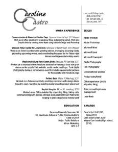
Hello all! This is my resume. The first aspect of my design strategy that I concerned myself with was the wordmark. I knew I wanted to do something creative with the repeating C’s of my initials. This turned out to be a little difficult because the letter “C” tends to make this awkward white space, especially when you increase the font size. I had trouble placing the remaining letters of my name in a way that was readable and fluid, but I think I finally got it right. I used the script to offset the very plain, clean-cut font (Avant Garde) in the remainder of the text. The meat of my resume was not organized this way until the day before we turned it in; it was originally in two columns flush left, but I decided it was simply too boring. In this way I hoped to convey my voice; I like to create structure in a creative way. I hope this is readable because I like the way it is balanced on the page. My target audience would basically be any potential employer, considering I am still not sure where the career winds will take me. Au revoir!

Heidi Chu: Post No. 1

19 Sep

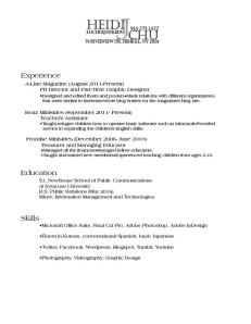
My target audience is within the wide spectrum of corporations, small companies, and even law offices because my interests and goals of the future revolve around the career paths of a lawyer and a public relations practitioner. This is why I wanted to have a professional, dependable voice more than any other; my design strategy was essentially achieving the most neat, business-like resume possible. Rather than a cheerful, or a quirky voice, I aimed for a professional one because that is what I would look for as an employer and professionalism is what, I feel, is most valuable in a resume. So, after multiple versions of my name in ornamental, script, and bubbly typefaces, I eventually ended up with this one. It’s not necessarily artistic, or exceptionally appealing, but I chose it because it was the most formal of all my drafts. Through the typefaces of both my wordmark and my body text, I felt that I achieved a professional voice while also presenting myself as someone with potential and organizational skills.

Kelsey Capobianco: Post No. 1

19 Sep

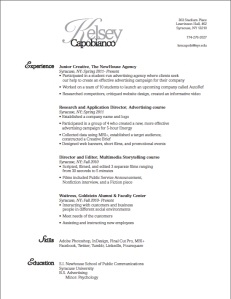
After making several drafts on InDesign, this is the outcome of my work. I chose to keep my resume simple. From the text choice to the positioning of the text, everything flows in a manner in which my audience can understand while skimming a resume. I did not use two columns of text because I feel like it becomes too busy and less fluid. The voice of my resume is simple and organized. My personality is usually very loud, but I was struggling with creating a loud voice that seemed professional. Therefore, I chose to reflect my organizational skills in the resume. I am in the process of gaining more experience in which I can add to my resume. Until I feel it is suitable enough to use for a profession in the advertising field, my target audience is appealing towards on campus activities, such as magazines and those who are looking to advertise for their organization. My design strategy was to maintain a simplistic layout while showcasing the experience I have acquired thus far. I am going to continue to expand and reform my resume with the new skills I have learned to perfect its presentation.

Lauren Duda: Post No. 1

17 Sep

Hello all,

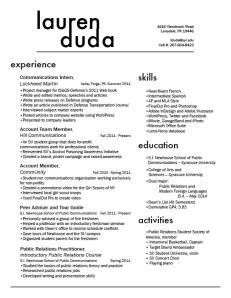
Here is my resume—a proud product of many hours of work on InDesign.  My personality is very bubbly and happy, but if my design was entirely based upon these emotions, it would hardly be appropriate for a professional resume. So, I designed one that reflected my diverse interests, but was also professional. I am a public relations major, and so my target audience would be a potential employer at a public relations agency, firm, or corporate communications enterprise. Public relations practitioners tend to be very clean-cut and well put-together, and so I wanted to create a resume that reflected that. This was essentially my design strategy. I knew I had a lot of content, and my main concern was devising a spatially conscious way to include all of that. By using sans serif fonts I eliminated excess font clutter, and I avoided confusion by using larger headers for each section. My wordmark also reflected my desire to remain clean-cut and creative. For this, I used Futura font and added tracking between the letters in “Duda” in order to perfectly line up my first and last name.

Looking forward to seeing your other resumes,

Lauren D.

Brian Grove: Post No.1

20 Sep

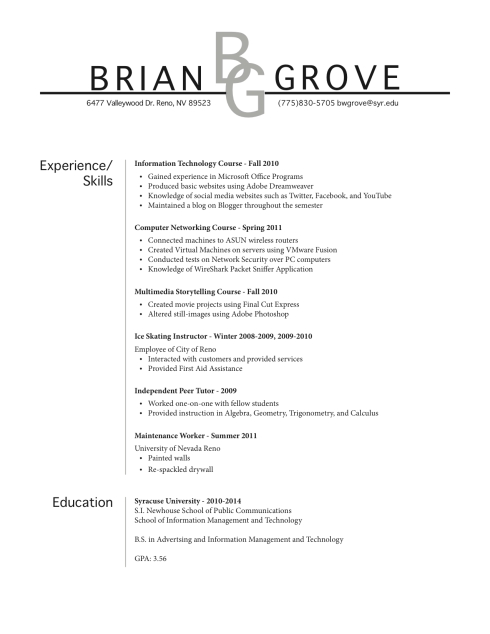
I think that any resume needs to be professional and I think that my resume and my wordmark display that. Almost to the point where the “BG” looks like the logo for a law firm or insurance company. I admit, I am a loud person and have a very bold personality so I went with the all capital letters in my name to make it bold and really stand out.I went with the underline to separate the big name with the contact information and from the rest of the body type. The wordmark is a lighter shade because when it was at full black it made the name distract the eyes when you were trying to read the body text. I went with Geneva text because it was a sans serif that I really liked, and I feel that the sans text is more “balanced” as professor Sanefski stresses. For my body text I went with Minion Pro because the serif contrasted against the plain bold strokes of the sans text. I combined the Experience and Skills section because I didn’t feel the experience section didn’t look big or substantial enough to stand on its own so I combined the two and created the big section you see in my resume. I used gray lines to separate the section titles and the body text because it went with the wordmark’s line and tint.

I would say my voice is loud, bold, but still professional and dignified. I designed it for a business executive in either the advertising or PR industry. I wanted to go for something that grabs the attention of the reader but doesn’t distract with gimmicks or curves.